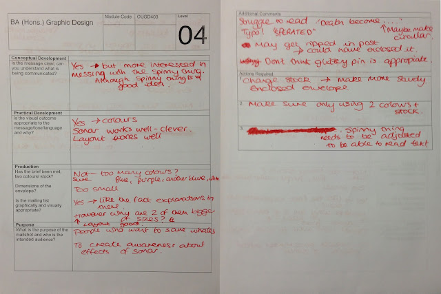
The Crit Feed back sheets which I received
I am moderately happy with the feedback I've received, the text seems to communicate the message correctly and the intended audience is also correct. However, there are alot of things which need adjusting. Firstly, most importantly, is adjusting the variables to fit the brief, the sizing of the mail shots is wrong, it should be 220x110mm, mine is not. The original document in Illustrator is the correct size, however, due to the printer size adjustments and the crop marks being squeezed on the page, the mail shot as reduced by around 1-2cm, which I didn't notice. I'm pleased this was pointed out in the crit, otherwise I would have not met the criteria asked.
Another error which was pointed out is the colour balance, in the illustrator file, I use two different shades of blue, and their half tones. However, due to a printing error, again, some of the colours appear purple or grey, not looking like a half tone of one of the original blues, so, I must make this more clear in the improved mail shots.
Another adjustment which needs to be made involves the sonar wheel, which can be found inside the leaflet, although I think this is a nice concept, It is hard to achieve, and it didn't work effectively. It was flimsy and it made some of the text hard to read, I also had difficultly obtaining appropriate split pins, so the ones I ended up with had a glittery texture, which do not fit the theme of the mail shot, so I'm going to remove it and only use the text under the sonar wheel.
Another dilema, I'm not longer able to access the digital print room, which means I'm limited to A3 paper only, so, I'm going to have to alter the fold of the page, so it fits on A3, rather than having a vertical crease, so it folds out horizontally which would exceed the page size, I'm going to have to have an horizontal crease, so the page folds vertically.
Another dilema, I'm not longer able to access the digital print room, which means I'm limited to A3 paper only, so, I'm going to have to alter the fold of the page, so it fits on A3, rather than having a vertical crease, so it folds out horizontally which would exceed the page size, I'm going to have to have an horizontal crease, so the page folds vertically.
See further designs for the re-edit


Leave your comment