OUGD402: STUDY TASK 5 - Where Am I Now?

10 things that you have learned about yourself as an individual and as learner. These should reflect your personal development and individual journey since the start of the programme.
  • I have learnt that myself, as a learner, I am more leant towards the practice part of the process.
  • I have learnt, since I began here, that as a designer, I'm into the clean style, the modernist-influence style, as aposed to the post-modernist cluttered style. 
  • As learner, I have discovered that I use other mediums, such as film, rather than Graphic Design to influence and inform my design process.
  • As a learner, I've begun to understand the importance of crits and feedback, and using this to inform your work, to make it better.
  • As a learner I feel like I have improved my ability to collaborate with other members of the group, rather than undertaking the tasks myself. I think this is because the standard within the group is incredibly high, and I don't need to fear that the end product will look awful.
  • However, in response to the statement above, as an individual, I do prefer working alone, approaching projects from my own unique angle, being able to experiment with my skill set to produce something different, rather than having to accommodate other's skill sets.
  • As a learner, I think I need to start stepping outside of my comfort zone more, when it comes to creating the product, rather than dashing straight to Illustrator or InDesign upon finishing my design sheets.
  • As an individual, I have learnt that I'm good at managing my time, to my surprise, I'm getting all the work done for it's deadline-date, and I'm able to have down time along side this. I'm pleased to say, I believe I've found the balance.
  • As a learner, I believe that my weakness in terms of responding to a brief would be the research section, I tend not to narrow my searches into a specific point, I find I stay rather broad and get mediocre  uninteresting findings, this is something I hope to work at and improve in the current module, OUGD406: Design Practice 1.
  • As a learner, I feel that I could also learn to develop me designs, from my thumbnail sketches further. By this i mean, that i could explore the concept more. I will develop this ability over the current module.
10 things that you have learned about yourself as a designer. These should reflect your growing awareness of your own interests within graphic design as a subject, discipline and profession.
  • I have learnt, since I began here, that as a designer, I'm into the clean style, the modernist-influence style, as aposed to the post-modernist cluttered style. 


An example, above of my work, and how what I would consider to fit this style.

    Above, is an example of some work which I think fits the clean style, which I attempt in my work, using shapes and vector images rather than drawings, paintings or physical artwork as the the image which I would work with.


    • As a designer, I feel like I'm good at creating thumbnail sketches to generated and extend ideas, to create the best posible layout and plan for the solution.


    • As a designer, I have developed in an intrest in the vector drawings, using abstract shapes and lines, rather than tracing for creating an image as you would imagine it, using traditional methods, with shading.
    • As a designer, I think I developed an attachment to using a very small selection of colours within each piece of design. For example, in a past module, OUGD405 Design Process, I used few colours within my final product, using blue orange and stock colours. 
    • As a designer, i have begun to use more simple designer, than rather artistic mediums, such as experimental water-colour pieces or paintings with custom brushes.
    • As a designer, i have discovered a passion, that is working with body copy, in a magazine style, being able to use columns, margines, guides to wrap text around, and create a pleasing style, along side with images. 
    • As a designer, I think that I have developed my ability to generate ideas, and create my own work in the style or in influence of another designer, using them to inform my work, and create a more visually dynamic outcome, in a style other than my own.
    • As a designer, I have learnt that more does not mean better. Infact, I would almost go as far to say, less can mean better. Rather than cluttering the page, filling it with images, type and info-graphics, a much cleaner simple layout, with only the essential points, facts and ideas usually works better.
    • As a designer, I have become reliant on the process leading up to the product, using the generation of ideas to the fullest, rather than designing things on the spot, based on one random idea I've summoned from no-where. Creating thumbnail sketches, development sketches, mock ups experimenting with concepts to create the best final product.


    OUGD402: PPP1 - STUDY TASK 4 - WHAT IS GRAPHIC DESIGN FOR? - Part 1

    Task
    Using the areas of Graphic Design discussed  in the seminar, studio workshop as a starting point and with reference to the 'What is Graphic Design For - Part 1/2' presentation. Identify, record and evaluate a minimum of:
    •  5 examples of websites/blogs. that will help you to define information & way-finding design. 
    •  5 examples of websites/blogs. that will help you to define product & packaging design. 
    •  5 examples of websites/blogs. that will help you to define branding & identity design.
    •  5 examples of websites/blogs. that will help you to define editorial and publishing design.
    •  5 examples of websites/blogs. that will help you to define retail and & promotion.
    You should aim to identify sources that represent the breadth of design practices, functions and audiences. Once you have identified your sources, you will need to:
    • Write a brief statement defining your understanding of each of the design areas
    • Identify 10 examples of each discipline and 'categories' them by genre, audience, content, sector, budget and/or any appropriate method as discussed in your groups.
    • Comment on the effectiveness of the examples with regards to content, format, function and media.

    5 examples of websites/blogs. that will help you to define information & way-finding design

    1. http://www.wolfstrome.com/ -  Wolfstrome is a website which specialises in way-finding, creating solutions for various situations, ranging from Environmental Design to Fabrication.
    2. http://www.endpointsigndesign.com/service/wayfinding - End Point have designed way-finding services for various companies, such as the royal college of art, they have also worked in health care, having a broad range of way-finding experience.
    3. http://www.designworkplan.com/wayfinding/introduction.htm - Design Work Plan defines way-finding and introduces us to the basics, such as how it works, and how it's effective.
    4. http://wayfindinguk.wordpress.com/ - Way-finding UK is a blog which specialises in way-finding, they conduct investigations into the effectiveness of way-finding around the UK. 
    5. http://environmentalgraphicdesign.blogspot.co.uk/ Environmental Graphic Design is a blog which talks about way-finding, with various examples of effective way-finding and explanations to why they're effective. 

    5 examples of websites/blogs. that will help you to define product & packaging design

    1. http://www.designcouncil.org.uk/about-design/types-of-design/packaging-design/ - Design Council talk about various aspects of design; they have a section dedicated to Product & Package design, where they talk about they roles which the packaging must take to be effective.
    2. http://www.packagingoftheworld.com/ - Packaging of the World is a website which showcases effective, creative methods of packaging, and have articles explaining their effectiveness.  
    3. http://www.icanbecreative.com/175-creative-product-packaging-designs.html - I Can Be Creative is another design website, which showcases creative and effective examples of packaging, and containing articles which explains why they work extremely well.
    4. http://www.cummingsdesign.com/PackagingIntro.htm - Cummings Design is a website, for company of the same name, who showcase packaging for companies which they've creatred, this includes packaging for companies such as Pepsi Cola.
    5. http://www.fastcodesign.com/1671492/designing-packaging-isnt-easy-heres-all-the-innovation-you-dont-see - Fast Co. Designs is a blog which contains articles on various subjects, many of which talk about product and packaging design, the specific post which I've found, which is linked to above talks about the process involved in creating creating and effective packaging, it's extremely interesting.

    5 examples of websites/blogs. that will help you to define branding & identity design


    1. http://www.brandingidentitydesign.com/ - Branding Identity Design is a website which contains articles specifically on the subject of branding and identity, they also showcase creative and effective examples of branding.
    2. http://www.davidairey.com/ - David Airey is a blog which features many examples of Branding, the owner, David, is widely regarded as the opinion leader on logo design by much of the online design community.
    3. http://www.thedesigncubicle.com/ - The blog contains many wonderful articles on branding identity and logo design, whilst also covering many other topics in the world of Graphic Design.
    4. http://www.helveticbrands.ch/ - Helvetica Brands is a blog from Swiss Designer David Pache, the site is primarily for David's portfolio, however it does contain many great articles on brand and Identity Design. 
    5. http://logodesignerblog.com/ - Logo Designer Blog is a blog, run by Jacob Cass, containing many great articles on Branding and Identity Design.

    5 examples of websites/blogs. that will help you to define editorial and publishing design


    1. http://magculture.com/blog/ - The Mag Culture blog, a subsection of the Mag Culture website features many articles about editorial and publishing design, showcasing creative examples.
    2. http://www.shillingtondesignblog.com - Shillington Design's blog also provides a great reservoir of information on editorial and publishing design, articles talking about some great examples of publishing design.
    3. http://www.basedesign.com/#/cat/edi - The subsection for editorial at Base Design is also another great resource for Editorial and Publishing Design, with hundreds of creative examples, articles which provide in-depth reading on the subject.
    4. http://www.smashingmagazine.com/ - Smashing Magazine is a Graphic Design blog, which has some indepth articles on publishing and editorial design, which also showcase some great examples of editorial design.
    5. http://www.graphicthoughtfacility.com/ - Graphic Thought Facility is a blog which contains a subsection on publication. Where we find articles on types of publication, examples of design and analysis of creative publications.

    5 examples of websites/blogs. that will help you to define retail and & promotion

    OUGD401: Research Methods


    OUGD405: Design Progress -Study Task 1 - Group Crit

    Today we presented research in the form of a group crit, I presented the free boards, as you can see on my exam practice blog click here. First I began explaining my primary research my secondary research and my action plan. My primary research consisted of work which I collected, emailing charities, taking photographs, and doing a research section around Leeds, To verify what active charities are operating in Leeds. I also presented the responses from the charities, I asked them, if I were to donate 1 pound what percentage of that pound would go towards the cause, or emergencies, expenses, such as travel equipment wages, and what percentage will go towards future investments so advertising, to generate future income. My secondary research consisted of how the split is applied, so, I went on the internet and researched how it actually is used, for example I looked specifically some charities, and found out what they do for money, for example I found some posters are certain charity and I evaluate the effectiveness of the posters and whether or not it was worth the 7% of the budget. I also looked at merchandise, for example, I looked at fashionable wristbands made of rubber which you can purchase, And the effectiveness of creating awareness of the charity, and promoting the cause. I found that be over 9%, of the 1 pound which you can donate, will go towards paying for establishments, such as charity shops, and had offices. I also found that it pays wages for staff such as CEOs, executives CallCenter operatives and any other staff. Finally, I found out where the other 84% on the budget would go, and that was a cause, whether it be steeving starving children, or providing a dog in new home. Which is what you would expect from a charity!

    Feedback I received was generally good however we did establish that from the charity's reluctaantsey to release the spending percentages, that they may be ashamed of their percentages, And they may not want the public to know is it may deter donations. So, but I next briefing it'll be interesting to look into how providing the percentages to general public, if it affects willingness to donate to a charity.

    The question we were given the end of the Crit was; "How can I get more people to donate to charities?" This would lead on to the next brief on the week of 3 December 2012. Click here to see the progress on this weeks brief.

    OUGD403: Group Crit: Message and Delivery - Mail Shots


    The Crit Feed back sheets which I received 


    I am moderately happy with the feedback I've received, the text seems to communicate the message correctly and the intended audience is also correct. However, there are alot of things which need adjusting. Firstly, most importantly, is adjusting the variables to fit the brief, the sizing of the mail shots is wrong, it should be 220x110mm, mine is not. The original document in Illustrator is the correct size, however, due to the printer size adjustments and the crop marks being squeezed on the page, the mail shot as reduced by around 1-2cm, which I didn't notice. I'm pleased this was pointed out in the crit, otherwise I would have not met the criteria asked. 
    Another error which was pointed out is the colour balance, in the illustrator file, I use two different shades of blue, and their half tones.  However, due to a printing error, again, some of the colours appear purple or grey, not looking like a half tone of one of the original blues, so, I must make this more clear in the improved mail shots. 
    Another adjustment which needs to be made involves the sonar wheel, which can be found inside the leaflet, although I think this is a nice concept, It is hard to achieve, and it didn't work effectively. It was flimsy and it made some of the text hard to read, I also had difficultly obtaining appropriate split pins, so the ones I ended up with had a glittery texture, which do not fit the theme of the mail shot, so I'm going to remove it and only use the text under the sonar wheel.

    Another dilema, I'm not longer able to access the digital print room, which means I'm limited to A3 paper only, so, I'm going to have to alter the fold of the page, so it fits on A3, rather than having a vertical crease, so it folds out horizontally which would exceed the page size, I'm going to have to have an horizontal crease, so the page folds vertically.

    See further designs for the re-edit

    OUGD403: Group Crit 9/11/12

    Today, we had group crits. The crits were different to how we usually have them, we are split into two groups, and then asked to Crit three piece of work in 45 minutes. Which is unusual, although I enjoyed it! The Crit enabled us to get a wider range of feedback, getting feedback from three different people.


    The crits not done in person, we were out of the room, whilst other people critiqued our work. This meant people could be more 'brutal', than they would be in person to you. Getting more honest feedback from the critiques.

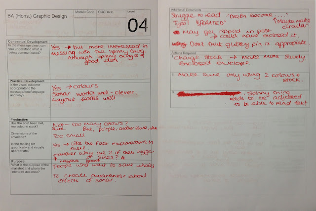
    The feedback I received was generally good, The three people, whom critiqued my work, all understood what I was trying to communicate, which was great news. As you can see below I have images of both sides of the critique paper, which they gave me following the crit.

    Insert images here.

    A couple of suggestions, which the critiques had, was to experiment more with colour, which I will try, However, the brief instructed only two colours, and stock (the paper) was to be used. Which, does not leave much room for experimentation, as the two tones of blue which I used and the White stock fore-fills. Another suggestion, which I was given, was to add some facts to the text pages, As the subject of Wales been affected by Sonar is not a common topic, so, not many people know the statistics. So, I shall try and include this in my next designs!

    Apart from that, all feedback was generally positive. They said my images work together, and they communicated the message very clearly and easily, this I'm happy with.
     

    Copyright 2010. All rights reserved.

    RSS Feed. This blog is proudly powered by Blogger and uses Modern Clix, a theme by Rodrigo Galindez. Modern Clix blogger template by Introblogger.