Showing posts with label OUGD402. Show all posts

OUGD402: PPP1 - Study Task 8: If You Were A...

If you were a book, what would your subject be and who would read you?

If I were a book, I would be an instruction manual of some sort, allowing things to be fore filled correctly and as easily as possible, detailing technical illustration drawings throughout, following my OCD-like passion for making sure the communication is clear and accurate, so the reader can achieve what he or she needs to. 

If you were a package what would you contain and who would open you?

If I were a package, to start with, the packaging itself would have two functions, It would not only be a container for the product it would have a second function to perhaps go with the product it contains, or even just a make-shift bottle opener. It would contain something technical, isometric, which would perform an important function. It would be opened by anyone who needs something doing. 

If you were a shop what would you sell and who would buy it?

If I were a shop, I would be a shop which sells solutions to problems, something which can issue a tool to create or fix something within someones life, for example, a logo for a company, if need be. It would be for anyone who wants something made. 

If you were a poster what would you promote and to whom?

If i were a poster I would promote the 1958 film, Vertigo by Alfred Hitchcock, as It is a wonderful film on the surface, with a very deep, dark undertone throughout, which leads to a fascinating analysis, It would be for any film fanatic. 

If you were a brand what would your values be and why would they be important?

If I were a brand, 

If you were an exhibition what would you show and where would you show it?

If I were an exhibition, I would show moment from history in film, to allow others to see the magical essence of film and cinema at it's finest - it's a real experience. I would love to show it in Hollywood which is the central locations for entertainment in the world, the home of cinema.

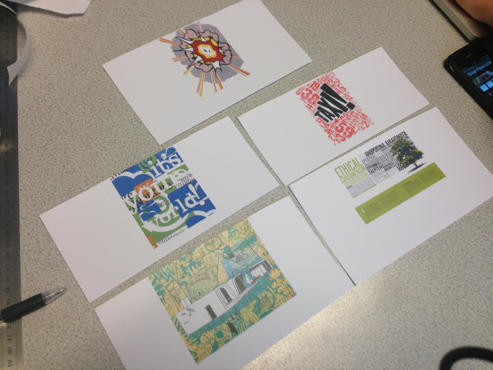
If you were a leaflet what information would you contain and who would read it?

If I were an information leaflet, I would most likely talk about film, once again, as it is a love and passion of mine, something which I feel I know great amount about. I would talk about the magic which is mise en scéne, I would once again show it to like minded people, perhaps cinephiles. 

If you were a sign what would you show, to whom and where?

if i were a sign I would show direction, to a location some way finding, fore filling a solution, to help someone have an easier and more informed experience. It would be for anyone who is lost. 

If you were an App what would you do and who would use you?

If I were an App, I would feature content and information about cinema, the goings on in the studios, which would aloo

If you were a blog, what would you be about and who would follow you?

If you were an event, what would it be and how would you promote it?


OUGD402: Studio Brief 2 - It's Up To You

For this PPP1 project we have to Design, develop and produce an information pack that effectively communicates or promotes you as an individual, designer and learner. You will need to reflect on the first year of the programe and aim to communicate what you have learned, the skills you have developed and how you see yourself applying them in the future. You should  also aim to communicate the context of your interest by referencing specific designers, studios, principles and audiences where necessary. 

We should use this brief as an opportunity to explore, develop and demonstrate content, processes and areas of design that interets you at this point in time and may indicate your emerging creative concerns in Graphic Design.

I'm going to use this post to explore examples of creative self promotion, and perhaps tie some ideas together to inform my own design for my self promotion pack. I hope to look at general self promotion packs, packaging design, business card design and perhaps even some creative CV designs, which I've seen a few times before. 

Jon Cleave's Self Promotion Package


Selma Roberts' Self Promotion Package


Matt Ludvigson's Self Promotion Package


Looking at the brief, I've decided to create a small fold-out which will have cards within it, clearly stating the following: 'Who are you now? What have you learned? What skills do you have? What do you know? What do you believe?' Whilst using my style to show my interests and support my statements.


Below you can see the interior content to the fold-out, which clearly answer the questions posed by the brief.

OUGD402: PPP1 Session (04/03/13)


Analysing a set of 10 images given, 5 from personal, 5 from a practitional standpoint. 

Emily

Practitioner
  • She seems to be a fan of typography, quite dense.
  • She doesn't really divulge into the minimalist style. 
  • She likes lots of colour,
  • She doesn't have a preference between modern and post modern work.
  • She likes work which is directed at children.
  • She's a fan of print - both letterpress and illustrational, 
  • In relation to fine art, she's a fan of Roy Litchensutein. - Fan of Pop-Art


Personal 
  • She likes watching films, the main genres of the films are Drama-Thrillers.- Likes films
  • She like skiing/snowboarding, or possibly just extreme sports. - Winter Sports
  • Music: She's a muse fan and generally likes music, indie-pop-rock. - Plays the Drums
  • Judging by the paparazzi photos, she may like photography. - She likes the celebrity culture


Anna

Practitioner
  • Minimalist style, with a subtle use of colour. 
  • She also likes the buss of geometric shapes to create a complex form, for example the rain drop out of red triangles. 
  • She admires clever use of typography, using bolds and italics to creating an empathises, or even colour.
  • She likes promotional work, which would be use to used in advertisements. 
  • A vast scale of typography, from huge blown up and cropped letters, to small body copy type. 
  • She seems very attached to Roman fonts. 
  • Clean style. 


Personal
  • The Catcher in the Rye by J.D. Salinger, possibly her favourite book.
  • A fan of the Beatles, which could suggest the genre of music she's into or the period of music she enjoys.
  • She also included an image of New York, so I assume this is her favourite place to visit.
  • She included a photo of her family, which would indicate that she enjoys spending time with them, or going on holiday.
  • She's from Liverpool, and she likes Liverpool. 


Bold text indicates what we were corrected upon, and the regular text was our assumptions. 

OUGD402: PPP Session (18/02/13)


1. What's your professional name and contact details?
  • Ant White 
  • anthonywhitegd.com
  • antwhitegd@gmail.com
2. What 5 words best describe your design practice?
  • Clean
  • Minimal
  • Simple
  • Bold
  • Blue
3. What 5 words best describe you as a person?
  • Dedicated
  • Determined
  • Drained
  • Blue
  • Awkward
4. What are your 5 strongest design skills?
  • Image Manipulation
  • InDesign efficiency
  • Illustrator efficiency
  • Idea generation
  • Design Process: Design Development
5. What areas of Graphic Design interest you the most?
  • Branding
  • Publication
  • Web Design
  • Typography
6. Who are your favourite designers/design studios?
  • Saul Bass
  • Neville Brody 

7. What makes these your favourite? (Where can you see their work?)
  • Saul Bass
    • His work on 1950s film posters, specifically Vertigo (1958)
    • http://Saulbass.tv
8. What are your favourite design blogs?

9. What are five things you want to be?
  • More efficient
  • More diverse 
  • More traditional (not using the Mac as much)
  • More to the point
  • More professional

10. What five things do you think you need to do to be this?
  • Focused
  • Experimental
  • Experimental
  • Clear
  • Experienced 
_________________________________________________________________________

TASK:

In a group of 3, design a THREE-ADS (3 Adverts) which will communicate the design practice of yourself and each of the other two people in the group.
  • None A-Format, but to an A3 scale. 
  • 50 words maximum. 
  • It can be type, image, type and image.
  • They have to be a different former for each one
What you produce for yourself, may look different for the other people. 

Look at their blogs, and look at their contextual references, it should reflect the design values of what they're intreated in. All work produced should be on your PPP blog. 

3 Printed Resolutions for 10am.

_________________________________________________________________________

Interviews

Laura

  • Laura Tomlinson 
  • LauraTomlinson@ymail.com
  • Quality
  • Innovative
  • Fun
  • Professional
  • NO FIFTH D:
  • Professional
  • Easy going
  • Massive foodie (Food lover)
  • Happy
  • Strong Design Skills
  • Idea generation
  • Screen print
  • book binding
  • layout design
  • Publishing
  • Editorial
  • Print
  • Retail Promotion
  • Stephan Stagmister 
  • Studio 8 (Defunct)
  • Wall Paper
  • Elephant Magazine
  • William Egliston
  • Google them
  • Record of The month - creative review
  • Design Week's - Book section
  • Magnation
  • Interesting
  • Taken Seriously as a Designer
  • Successful
  • Good Cook
  • More Creative
  • Hard Working
  • Focused
  • Skilled
  • Experimental
  • Experimental
Caitlin Walsh

  • Caitlin Wash
  • E-mail: c8_4@hotmail.co.uk
  • Through
  • Precise
  • Clean
  • Reinterpreted
  • blunt
  • Stubborn
  • Determined
  • Funny
  • Acting
  • Fun
  • Crafting
  • Composition
  • Photography
  • Layout
  • Colour
  • Branding and Idenity
  • Packaging
  • Information and Way finding
  • Lisa Nilson
  • Johnathan Branbrook
  • Zimmers Zool
  • Google them
  • Designspiration
  • Lovely Package
  • Behance
  • Coolinfographics
  • DesignWeekly
  • Successful
  • Happy 
  • efficient
  • Professional
  • Wider Creative Field 
  • Working Hard
  • Cheering Up
  • Focused
  • Work on her execution
  • Experimental

OUGD402: PPP1 - What is a Graphic Design Practice?


  • "Graphic Design is an ongoing examination/conversation between the dynamics of personal exploration and professional practice" - Matt Owens, Volumeone.
  • What is it that makes you, you? You need to establish the thing which separates you from the masses.
Three ways to determine an effective design practice
  • Appropriateness of response,
  • Quality of Resolution, - reflecting your ambitions
  • Meeting the deadline. - a good brief is one which comes in on time


Appropriateness of Response
  • What is the Problem
  • Who is the Audience
  • What is the Context?
  • What is the Method of Delivery?
What is a Problem?
  • Are you being asked to do something? Professional Standpoint 
  • Is it something that you want to do? Personal Standpoint
It comes down to your own personal preferences
  • Persuade, inform, ask questions, make a statement, give an order, deliver and instruction, make some laugh/cry?
  • What function is it going to perform?
What is your Rationale?
  • What are you doing, and why are you doing it?
  • You're doing it because you want to do it? Or are you doing it because you have to do it?
What's the way you work, under the Rationale? 
  • Concept driven 
  • Idea driven
  • Research driven
However, it's not always one, or the other. One is not always more important than the other.

Define what your practice is about, under the Rationale
  • Audience driven
  • Context driven
  • Media driven
Creating Briefs and choosing work, under the Rationale
  • Creative driven, a chance to create something extremely creative, and work with creative people
  • Ethical connection, being able to associate with their aims and ambitions
  • Commercially driven, soullessness - for the money.
Where do you sit within this? - if you don't position yourself within these, someone else will.

What are your outputs, how does your practice reflect the Rationale? What are your methods
  • Handmade
  • Digital
  • Lens Based
What are your dimensional abilities work with the Rationale? 
  • 2-Dimensional - Digital, flat
  • 3-Dimensional - Object,
  • 4-Dimensional - Time, movement, sequential development. a set series.


Quality of Resolution
  • Depth of appropriate research
  • Breadth of initial ideas
  • Selection of potential solutions
  • Thorough visual development
  • Attention to detail/crafting
  • Clarity of presentation 
Within that, we're also looking at Type and Or Image
  • Do you work with one more than the other?
  • You begin to develop your signature, something which is distinguishable as your own, using type and image
Is The Media the Message?

Tone of Voice
  • Do you like humouring your work? Is it funny?
  • Are you someone who is very authoritative?
  • Is it appropriate for the situation? 
It comes down to two key things which makes it better, what makes you, you
  • Try it,
  • Test it,
  • Make it better.
Remember to play, that is what will keep you moving forward.

Collaboration
  • The space between people working together is filled with conflict, friction, strife, exhilaration, delight, and vast creative potential.
  • With other designers, with other people of different professions.
  • Collaboration is not the same as group work.
  • Using other people's skill sets to help you produce the best work possible.


Meeting the Deadline
  • Time management,
  • Project management,
  • the is the key skill to develop,
  • being able to hand in the best thing you can, however, when you hand it in, you know you could do better.

Message, Communication Clarity and Context 

+

Creativity concept ideas

x

Skills, organisation, discipline, and commitment - These three things will help you create the perfect piece of work. 

/

Boundaries, Limitations, Rules and Time - These thing will stop you getting there.

Are the boundaries, limitations rules and time set by the industry? or are they set by yourselves?


An Effective Design Practice.


OUGD402: STUDY TASK 5 - Where Am I Now?

10 things that you have learned about yourself as an individual and as learner. These should reflect your personal development and individual journey since the start of the programme.
  • I have learnt that myself, as a learner, I am more leant towards the practice part of the process.
  • I have learnt, since I began here, that as a designer, I'm into the clean style, the modernist-influence style, as aposed to the post-modernist cluttered style. 
  • As learner, I have discovered that I use other mediums, such as film, rather than Graphic Design to influence and inform my design process.
  • As a learner, I've begun to understand the importance of crits and feedback, and using this to inform your work, to make it better.
  • As a learner I feel like I have improved my ability to collaborate with other members of the group, rather than undertaking the tasks myself. I think this is because the standard within the group is incredibly high, and I don't need to fear that the end product will look awful.
  • However, in response to the statement above, as an individual, I do prefer working alone, approaching projects from my own unique angle, being able to experiment with my skill set to produce something different, rather than having to accommodate other's skill sets.
  • As a learner, I think I need to start stepping outside of my comfort zone more, when it comes to creating the product, rather than dashing straight to Illustrator or InDesign upon finishing my design sheets.
  • As an individual, I have learnt that I'm good at managing my time, to my surprise, I'm getting all the work done for it's deadline-date, and I'm able to have down time along side this. I'm pleased to say, I believe I've found the balance.
  • As a learner, I believe that my weakness in terms of responding to a brief would be the research section, I tend not to narrow my searches into a specific point, I find I stay rather broad and get mediocre  uninteresting findings, this is something I hope to work at and improve in the current module, OUGD406: Design Practice 1.
  • As a learner, I feel that I could also learn to develop me designs, from my thumbnail sketches further. By this i mean, that i could explore the concept more. I will develop this ability over the current module.
10 things that you have learned about yourself as a designer. These should reflect your growing awareness of your own interests within graphic design as a subject, discipline and profession.
  • I have learnt, since I began here, that as a designer, I'm into the clean style, the modernist-influence style, as aposed to the post-modernist cluttered style. 


An example, above of my work, and how what I would consider to fit this style.

    Above, is an example of some work which I think fits the clean style, which I attempt in my work, using shapes and vector images rather than drawings, paintings or physical artwork as the the image which I would work with.


    • As a designer, I feel like I'm good at creating thumbnail sketches to generated and extend ideas, to create the best posible layout and plan for the solution.


    • As a designer, I have developed in an intrest in the vector drawings, using abstract shapes and lines, rather than tracing for creating an image as you would imagine it, using traditional methods, with shading.
    • As a designer, I think I developed an attachment to using a very small selection of colours within each piece of design. For example, in a past module, OUGD405 Design Process, I used few colours within my final product, using blue orange and stock colours. 
    • As a designer, i have begun to use more simple designer, than rather artistic mediums, such as experimental water-colour pieces or paintings with custom brushes.
    • As a designer, i have discovered a passion, that is working with body copy, in a magazine style, being able to use columns, margines, guides to wrap text around, and create a pleasing style, along side with images. 
    • As a designer, I think that I have developed my ability to generate ideas, and create my own work in the style or in influence of another designer, using them to inform my work, and create a more visually dynamic outcome, in a style other than my own.
    • As a designer, I have learnt that more does not mean better. Infact, I would almost go as far to say, less can mean better. Rather than cluttering the page, filling it with images, type and info-graphics, a much cleaner simple layout, with only the essential points, facts and ideas usually works better.
    • As a designer, I have become reliant on the process leading up to the product, using the generation of ideas to the fullest, rather than designing things on the spot, based on one random idea I've summoned from no-where. Creating thumbnail sketches, development sketches, mock ups experimenting with concepts to create the best final product.


    OUGD402: Question 5

    The Quality of written elements - are they well structured? Am I using broad graphic-design-vocabulary?

    OUGD402: Question 4

    Does my blog show individual improvement? Can you see me developing and improving?

    OUGD402: Question 3

    Are all of my blogs consistant? By this I mean, do they support each other, with an even spread amount of work with co-insides with each other?

    OUGD402: Question 2

    Am I communicating my ideas effectively? Are there links between the brief? Is it consistant? Is there a substancial record of visuals?

    OUGD402: Question 1

    Is there a substancial amount of research on my blogs? Are the images analysed to a high standard? Is there a good selection of images?

    STUDY TASK 3 - What is Graphic Design? - Part 2


    Context


    The recognisable 007 brand logo of the James Bond Franchise, I really like the simplistic design of this brand logo, which has stood the test of time since the 1962, when the first film of the 23, soon 24 super series was shown.


    The above would be intended for publication, as the context. I really do like the design of this, and it's monocrome theme with the cream colour poping the image.


    The above's context is advertisement. It features a nice simple design, easy to read, and clear. It also uses the James Bond brand along side this as endorsement, It's also using a very limited colour range in the ad, which works very well.


    The above is an info-graphic, the context being directional way-finding. I really like the simplicity of the designs, nice, clean and to the point, easy to see, and the images on the signs make them understandable, even without the text.


    The context of this would be promotional, it's a mini decorated in the Park Inn colours, Park Inn are recognisable by their bright colours in the checkered pattern, so covering a car is a really fun and creative way to be promotional.


    Functions


    The above is an info-graphic, the function of which is informing people about the Titanic tragedy, in an interesting and creatively beautiful way. I really like the design of it, and the colour scheme, using simplistic vector designs. It's really cool.


    The above, the function being an info-graphic, informs us about the history of projection screens, dating back to the cave-men era to modern day home cinema in the basement. I really like the red limited colour scheme in the images, which correlates with the heading copy in the white text boxes to the side.


    The above, the function of which, being again an info-graphic, Illustrates the advancement of human weaponry throughout time, in a simple and creative way. Once again, I really like the style of this, the vector shapes creating the tanks ans skyscrapers, and the people look fantastic, in the limited colour set, or yellows and greys. 


    The above, the function, once again, being an info-graphic set to inform people survey results, about "which Star Wars fi'm is the most favourited", it communicates this well.


    Finally, for this section, we have another image, which it's function is to inform; it's in info-graphic. It takes a some-what boring subject and communicates it in a interesting and attractive way, I really like it. The break down of the images makes the process much easier to understand. 


    Messages/Ideas/Concepts


    The above is a message, communicating a thank you to whom ever the recipient may be. I really like the design of this, it looks very well presented in a very thought out design. I also like the use of colour, using less saturated colours, and a limited colour set.


    I really like this image above, it's an message, it's an invitation to a BBQ, as you can clearly see. It's well layed out, using oranges, blues and black as it's main, limited colour set, and works really well!


    The above is a message once again, a message. It has a really nice and simplistic design to it, using a nice gradient of colour. 


    The above is an expressive statement, It's communicating anti-racism, and the hatred towards racism. It works really well, the monotone colours with the orange making the key words pop in the image, in a contrast to the blacks and whites.


    The image above is another expressive piece, it communicates the artist's narcissism in a creative way. It's nicely layed out, and it uses gradients to separates the phrases.

    Tone of Voice


    The above is an example of a blunt mature type of voice.


    The above uses a mature, clam tone of voice, presumably addressing a large audience.


    Another example of a mature tone of voice.


    The text itself in this image has a particularly mature tone of voice, however, the way in which the type is presented indicates an almost immature light hearted sense to the image.


    The final image of this set is a fairly light-hearted sensible, standard tone of voice, however the visual communicate in the image, the stylisation of the text adds a fun quality to the tone of voice, adding a layer of meaning to the image.


    Intended Scale


    The above would be printed business card size, which is roughly around 80x45mm. I really like the design of these, It's creative and cool.


    The above would be printed flyer size, A6. 


    The above would be printed poster size, between A3 and upwards, typically A1.


    The above would be a magazine spread, typically two A4 sheets, on one a A3 spread.


    The above would be a billboard size image, a very large image.


    How To Self Evaluation


    Study Task 1 - Why Am I Here - What do I want to Learn?

    Identify and explain 5 reasons why you chose to study on this programme
    • For a challenge,
    • To get the best possible opportunities for my future,
    • To become the best I possibly can be,
    • To be inspired,
    • To be tested.
    Identify and explain 5 things that you want to learn during your time on the programme.
    • How to be a professional,
    • How to visually communicate through design at a higher standard, 
    • How to design as efficiently as possible, 
    • More skills, 
    • How to price work/charge clients,
    Identify and explain 5 skills that you think are your strengths.
    • Photoshop, Illustrator, InDesign, Cinema 4D, Lightroom, After Effects (Mac Work),
    • Quick thumbnail sketches/planning work,
    • Time management, 
    • Meeting deadlines,
    • Working to Print,
    Identify and explain 5 things that you want to improve.
    • My planning and layouts,
    • My creativity,
    • My ability to create something new and original,
    • My Professionalism,
    • My Visual Communication.
    Identify and explain 5 ways that you will evaluate your progress.
    • Through group crits,
    • Through Tutorials,
    • Comparing newer work to older work,
    • Looking through past work on my blog,
    • Through my grades.
    Identify 5 questions that you want to find the answer to.
    • What standard is considered a "Professional Standard"? 
    • How can I turn my weaknesses into strengths?
    • How can I improve?
    • How can I become more professional?
    • What style of work should I specialise in?
    Identify and explain 5 things that inspire you.
    • Steve Jobs, always thinking outside the box, trying to see things in a new light, to create the best product possible.
    • Alfred Hitchcock, being able to create suspense and communicate through mise en scéne and pure cinema.
    • My Dad, Philip White, always being able to provide and help me when I'm in need, no matter what, whenever needed.
    • John & Hank Green, two brothers, whom through using a YouTube originally to communicate with each other, have changed online-media, shaped and moulded the community, creating something truly special.
    • Weight-lifting/body building, being an amateur myself, I'm able to appreciate the goal of being better, pushing harder, putting the hours in, to achieve more, and become the best you possibly can be, and then some.

    Identify 10 examples of design that illustrate your fields of creative interest.


    Hand-drawn traditional art, pencil. (Image drawn my me)


    Logo/Illustration/Vector design (Also done by me - rejected by a client)


    Photography (Panorama of the York Minster, done by me)


    3D Modelling (Created by me, in Cinema 4D)


    3D Photo-manipulation (Created by me, Cinema 4D and Photoshop)


    Creating images on Photoshop, from scratch. (Created by me)


    Magazine spreads (A college assignment, created by me)


    Typography (Reanimagic on Deviant Art)


    Film-Poster style designs (Made for animation, The Package III, by me)


    T-Shirt design (Design made for competitive eater, Furious Pete, by me)


    Copyright 2010. All rights reserved.

    RSS Feed. This blog is proudly powered by Blogger and uses Modern Clix, a theme by Rodrigo Galindez. Modern Clix blogger template by Introblogger.